Udacity Data Analyst Nanodegree. Project 6: Data Visualization
Summary
PISA is a survey of students’ skills and knowledge as they approach the end of compulsory education. It assessed the competencies of 15-year-olds in reading, mathematics and science in 65 countries and economies.
The aim of this project is creating an interactive graph that allows the reader to observe the connections between mean PISA scores per country and some variables. Some of these variables are correlated with the tests results as expected, but others are quite surprising. For example, the is positive correlation between restults and having a quiet place to study, having a computer, book or internet. But there is a negative correlation with playing chess of programming computers, and many users wouldn’t expect that.
The plot allows the user to change the axis, selecting the 3 different tests or one of the available factors.
The dataset is a csv file that contains a summary of some values from the original Pisa 2012 dataset.
Design
As we are working with different countries, the first idea was to use a choropleth map but that allows us to encode only position and one variable on the color and it can’t show correlations. We opted for a scatter plot, where we could use position but also area and color to encode more variables. Also, it’s a suitable plot to show correlations.
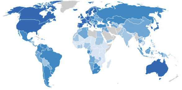
The idea was quite complex, so I decided to use D3.js but, as it is quite complex, I wanted to choose an example of code that would be similar to what I wanted to do. I found this excellent work by Peter Cook:
http://prcweb.co.uk/lab/what-makes-us-happy/
Version 1
My first approach was to use that plot with my dataset, adding the 3 tests scores and a couple of variables, just to see how it looked like:
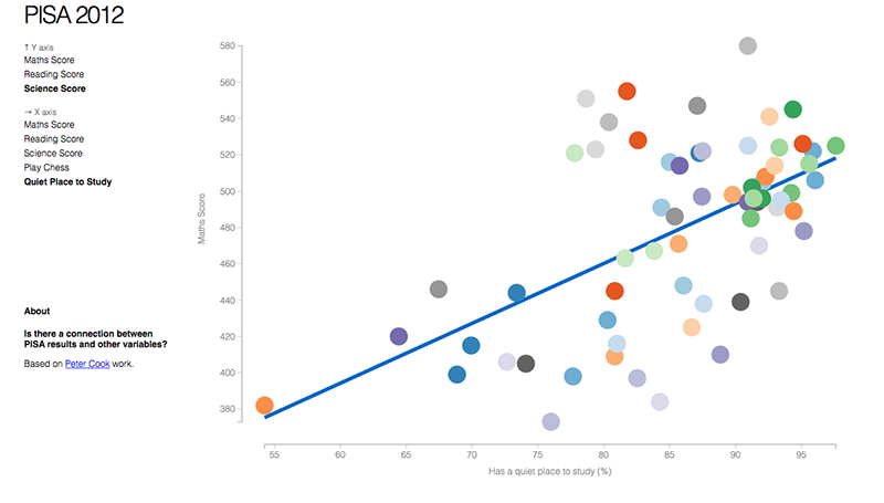
http://raul-p.github.io/pisa2012/v1/
Version 2
I had the chance to show the plot to professor Alberto Cairo from University of Miami and, according to his feedback, I decided to change the regression line, use the color to show the continent and the area to show the population of the country.
According to other people’s feedback, it was hard to find an specific country if it’s small, so I added a countries list and a black stroke in the circles when the user place the mouse over them.
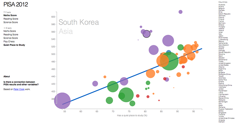
http://raul-p.github.io/pisa2012/v2/
Version 3
According to another person’s feedback, she didn’t know that PISA was so she couldn’t understand what was the plot about. So I decided to add an explanation and legends.
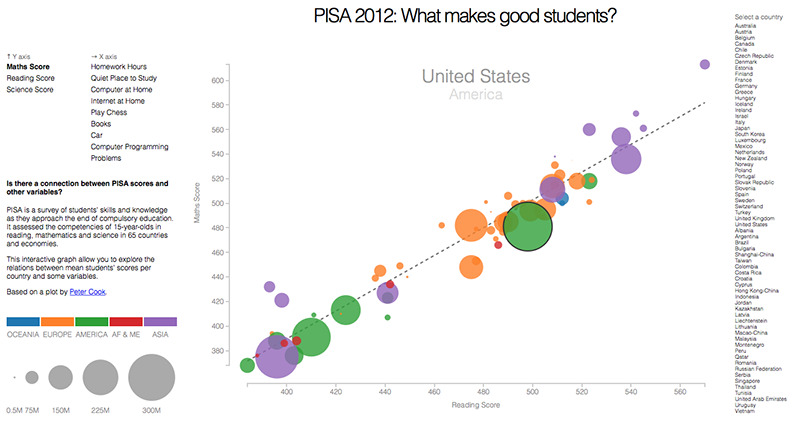
http://raul-p.github.io/pisa2012/v3/
Version 4
The problem is that there were too many elements and the plot was hard to see in computers with small screen resolutions or in tablets. So I tried removing the countries list. But some users told that this made impossible to select some countries.
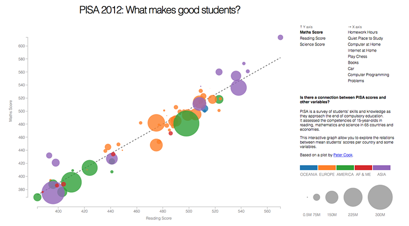
http://raul-p.github.io/pisa2012/v4/
Version 5
I finally decided to add a dropdown selector where the user can chose his country and follow it.
I also added a tooltip over the country, so now the user can know the exact values for a certain country.
I got inspired by: http://www.nytimes.com/interactive/2012/05/17/business/dealbook/how-the-facebook-offering-compares.html
I also changed the way the countries appear when the page is loaded: Now they appear according to their geographical location and then move when an axis variable is selected.
The elements were relocated so now it fits horizontally even in an old iPad.
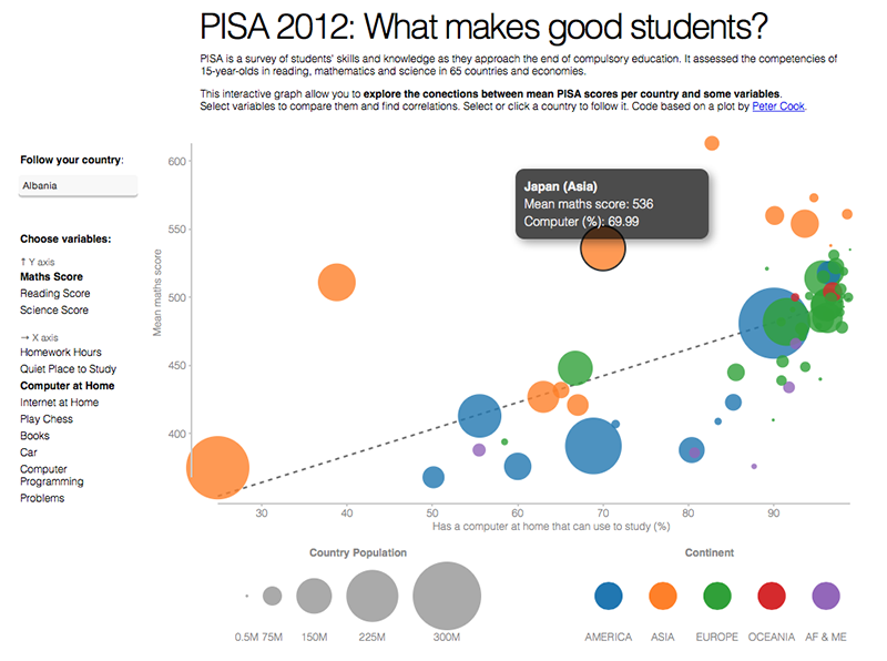
http://raul-p.github.io/pisa2012/v5/
Version 6
The last changes consisted on giving the option to the user to click on a country to select it and track it and to click again to unselect, as well as minor changes in the text.
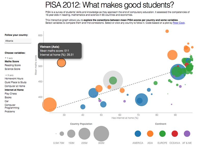
http://raul-p.github.io/pisa2012/v6
Final Version
The last changes consisted on giving the option to the user to click on a country to select it and track it and to click again to unselect, as well as minor changes in the text.
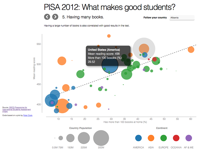
http://raul-p.github.io/pisa2012/
Feedback
Professor Alberto Cairo
After version 1:
The scatterplot is the best here. What does the colors mean? That must be indicated on the graph. You could add another variable using the size of the circles but what variable would it be? Population? If you do so, watch the opacity / transparency. Some circles may become difficult to see.
Use the colors to identify continents. If not, do not use different colors. Trend line doesn’t need to be so thick. You can do it much thinner, black, and dotted, rather than continuous. I think it would look more elegant.
Modify the vertical axis. Use multiples of 25 or 50. I think it will be better understood.
Subject 2
After version 1:
I like it, but I find to hard to locate my country in the plot. Could you add a countries list?
After version 4:
Now I can’t find my country again. I think this is very important for the plot to be useful.
After version 5:
There is a problem with the country selection. When I select my country and then place the mouse over it to see the actual x and y values I loose the selection and I have to select another country and then select mine again.
After version 6:
The visualization is presented with high aesthetic sense. Many aspects are included and compared: countries, scores, features, size of the countries, mean value of score and percentage of students in different countries.
The chart shows the effect of some features (homework hour, quiet place to study…) on math score, science score and reading score of students in several countries.
I find very interesting to discover a country’s respective study scores in comparision with other counterparts and how this position changes when we change the feature.
The data values are included clear and effective, the correlation between variables is well depicted.
After final version:
Now the plot tells me a story. I like that it also offers the opportunity to explore the relations by yourself.
Subject 3
After version 2:
I don’t understand very well what is the plot about. What is PISA?
After version 3:
Ok, now I understand but I can’t see it very well on my 15 inch Macbook. Elements don’t fit on the screen and I need to scroll.
After version 5:
I like the tooptil but it would be less confusing if it would follow the mouse, like in the NYT example.
After final version:
It works like a charm now. And I like the way the new navigation explains the correlations.
Person 4
After version 5:
It’s a little uncomfortable having to seek for Spain every time you change the axis. But considering that Europe is represented in green, and the size (which represents the number of inhabitants) of the circle, it can only be confused with Turkey, France or UK.
After version 6:
I draw the conclusion that in almost all the graphics on the various issues raised, Spain is more or less on the “average”.
It’s very interesting to see the relation between having a computer and internet with better results on the test!
Person 5
After version 6:
Looks good. I see some difference between Asian countries and Latin American countries, if you plot “Have computers at home” vs. “Math score”. The Asian countries are mostly on the higher side of math and science scores and Latin countries are mostly on the other side of the line. The negative correlation of playing chess and programming computers with the results is very surprissing.
Person 6
After version 6:
I don’t know about other countries but I know the reality of 15 years old Spanish kids and to me it’s clear that they lie on that survey. Over 38% play chess? More than 43% have more than 100 books? On average they spend 6.5 hours a week on homework? Over 42% spend time programming computers? Hard to believe!
Resources
D3: show data on mouseover of circle
The Facebook Offering: How It Compares
Adding a title attribute to svg:g element in D3.js
Remove all white spaces from text
Remove end-ticks from D3.js axis
Interactive Data Visualization for the Web